Nissan Silvia Prestige - Livery Design
The big question
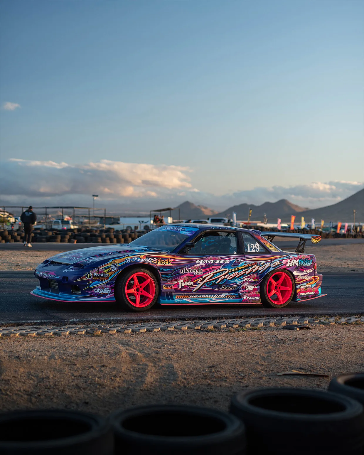
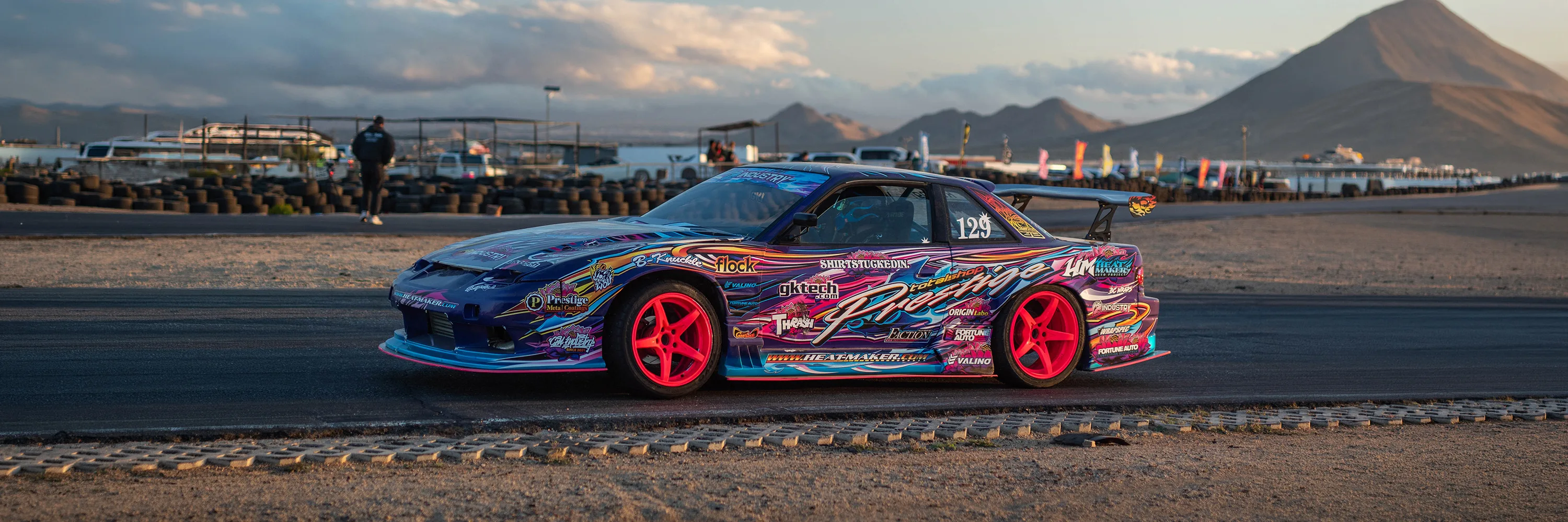
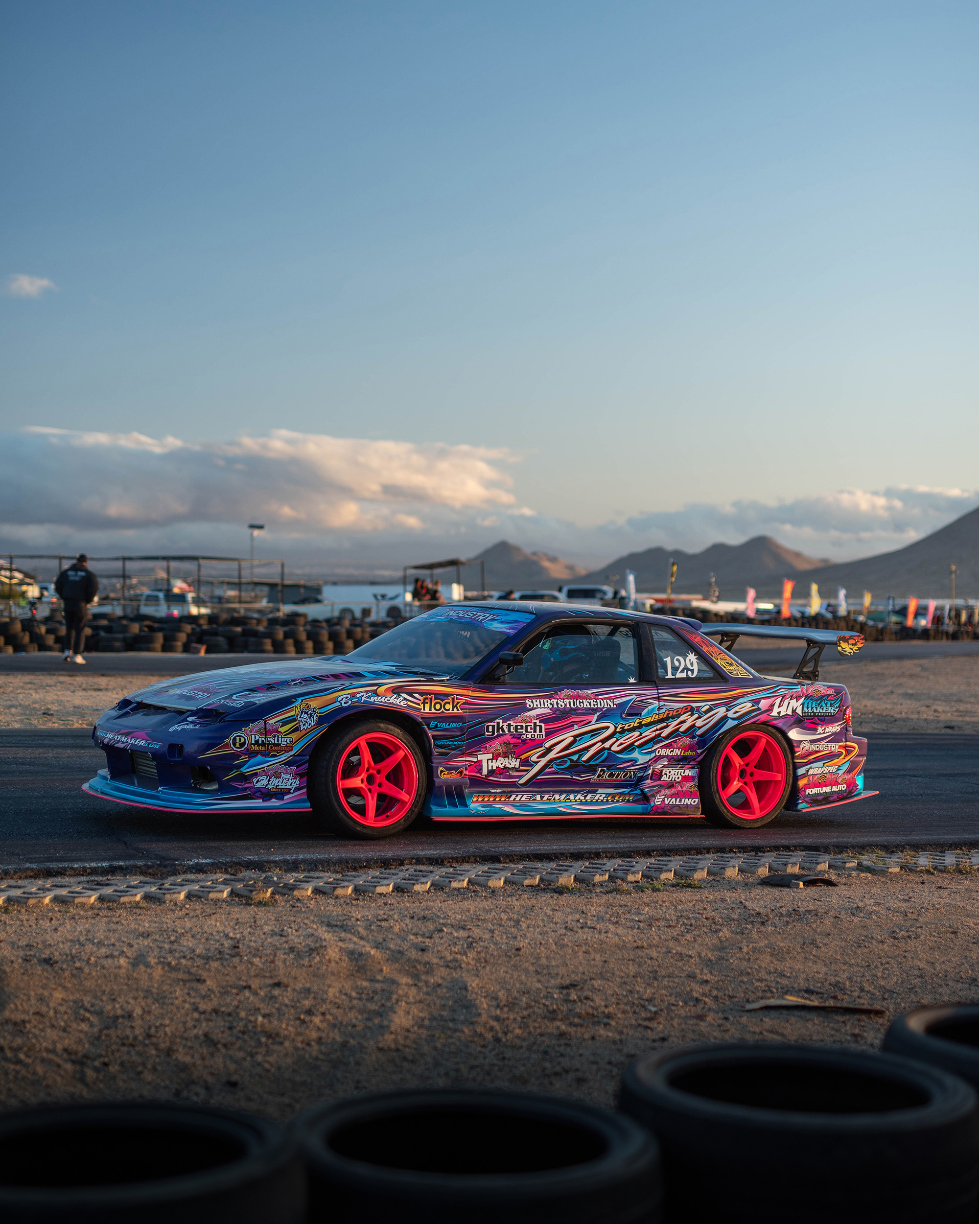
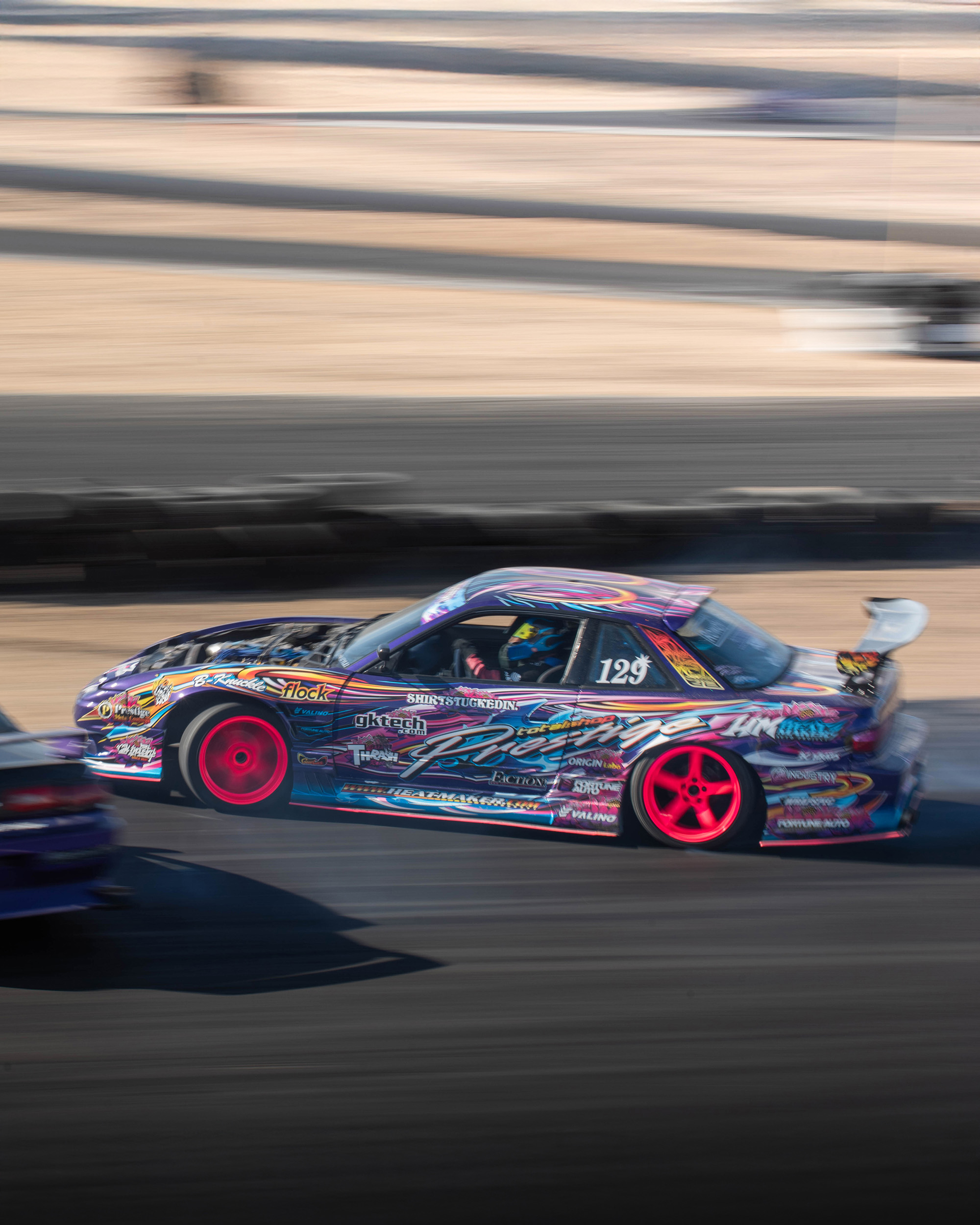
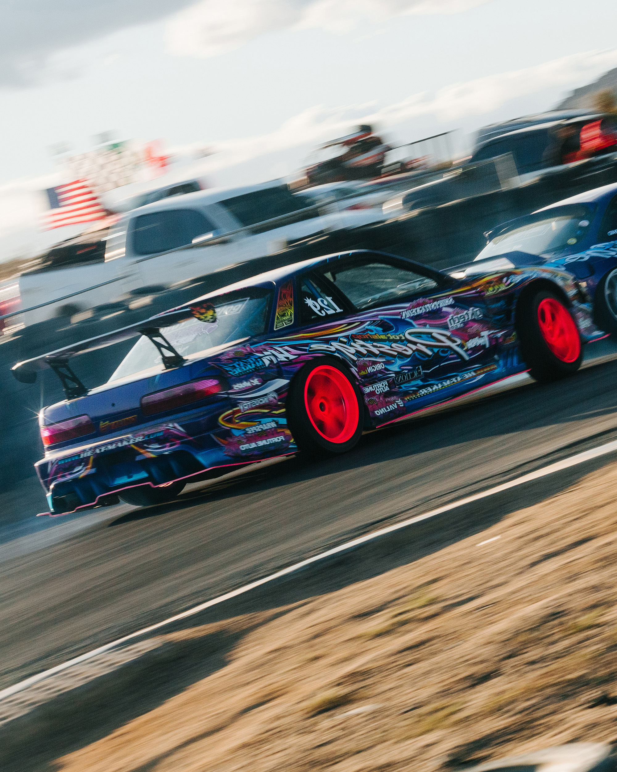
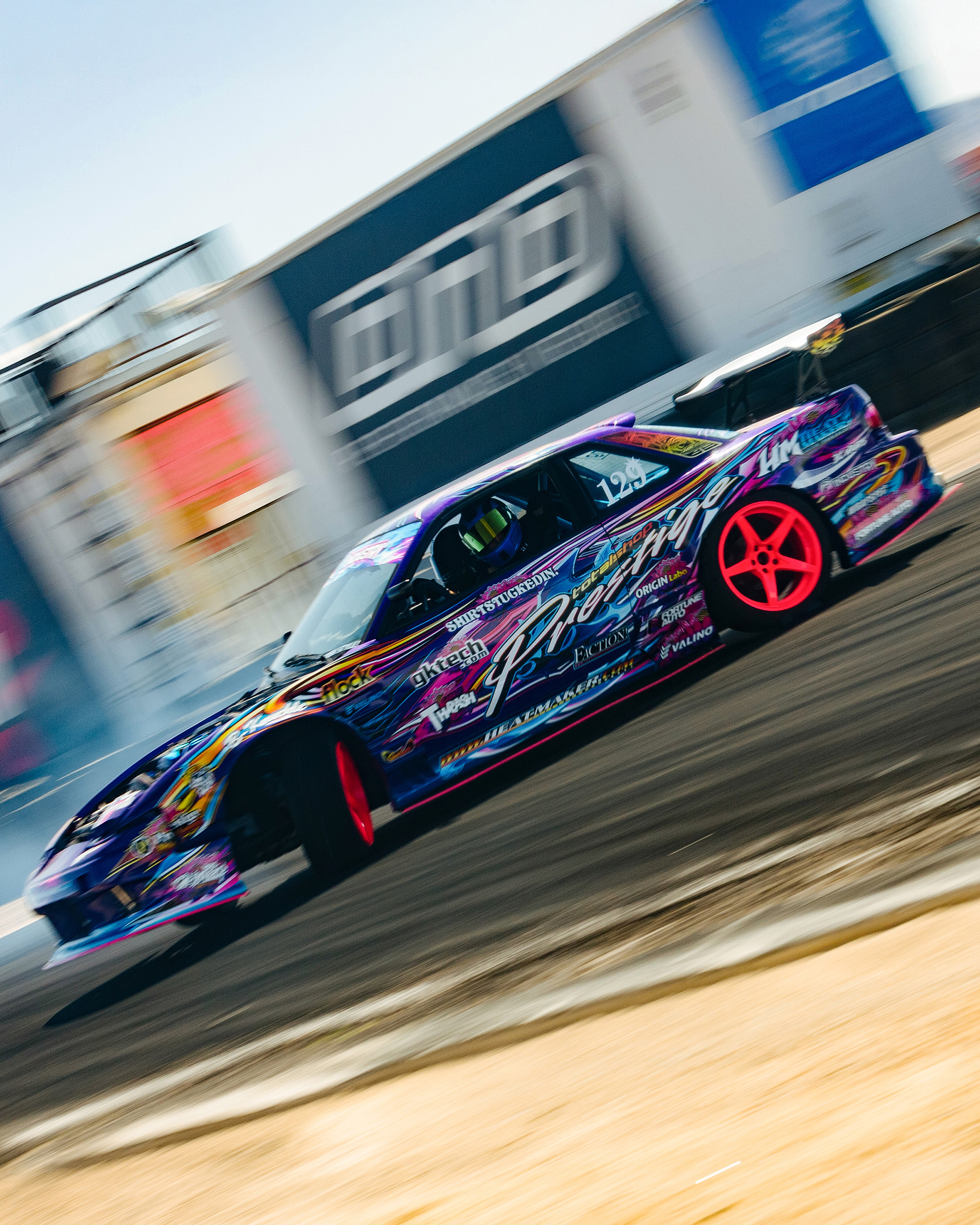
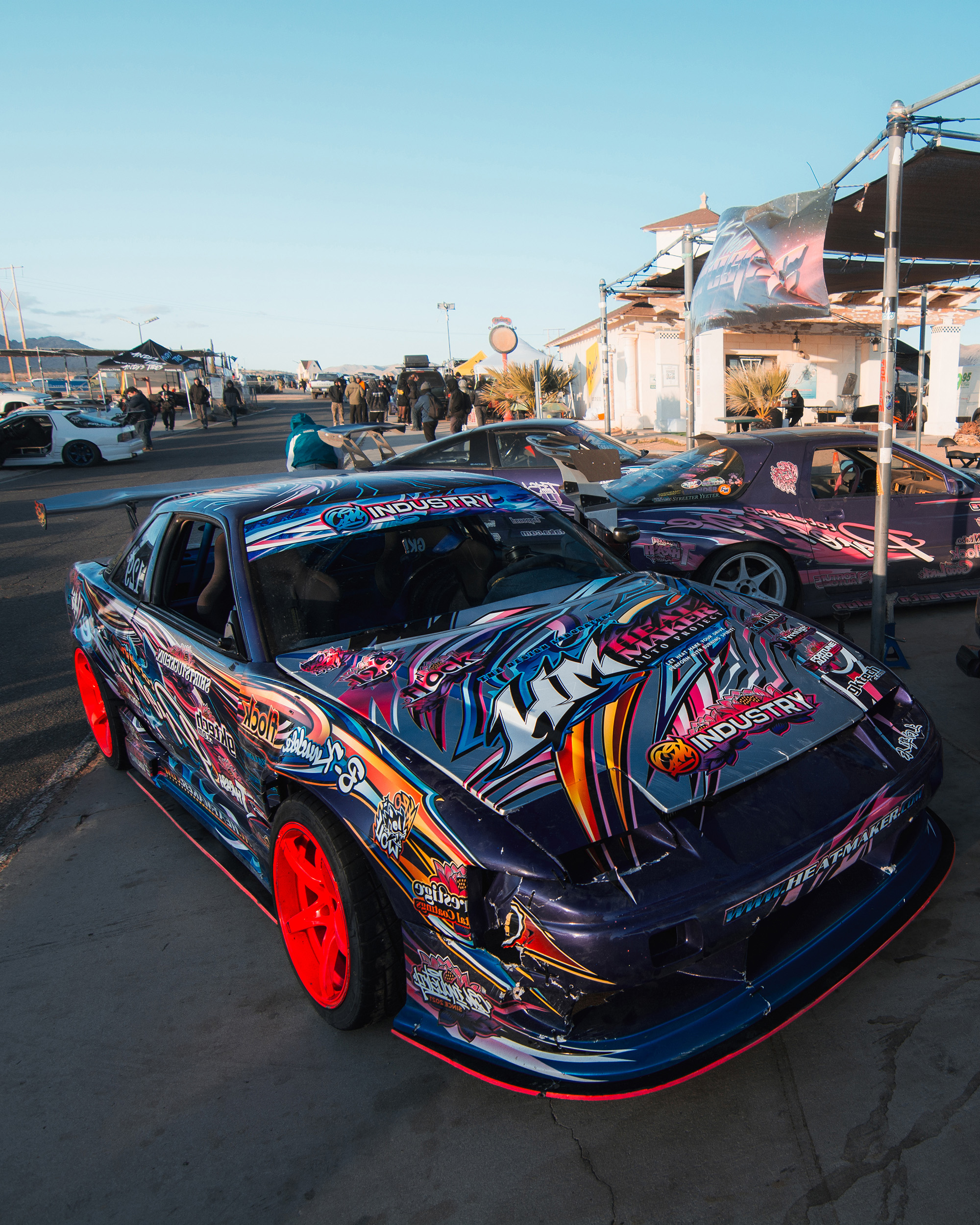
What does a D1 Grand Prix car from early 2000s Japan look like when you rebuild that era through a modern lens?
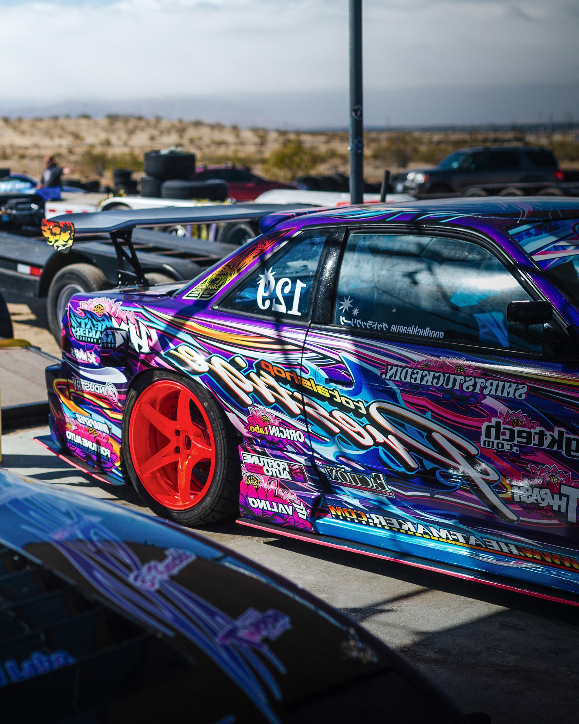
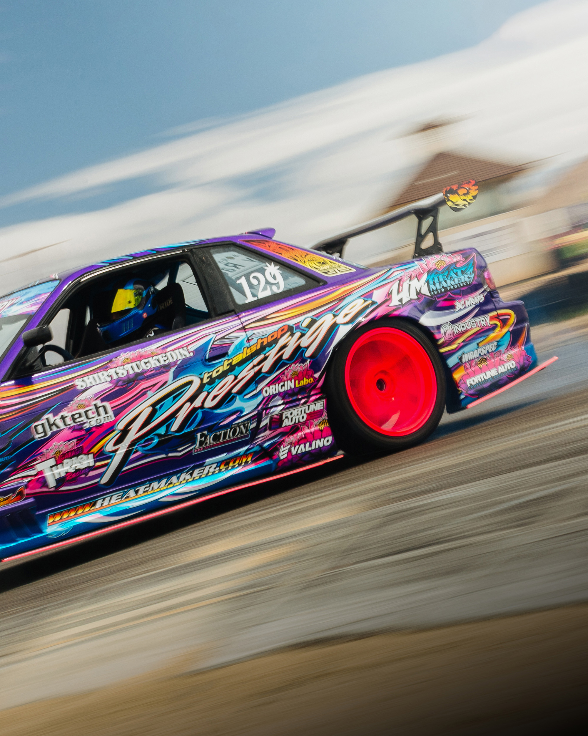
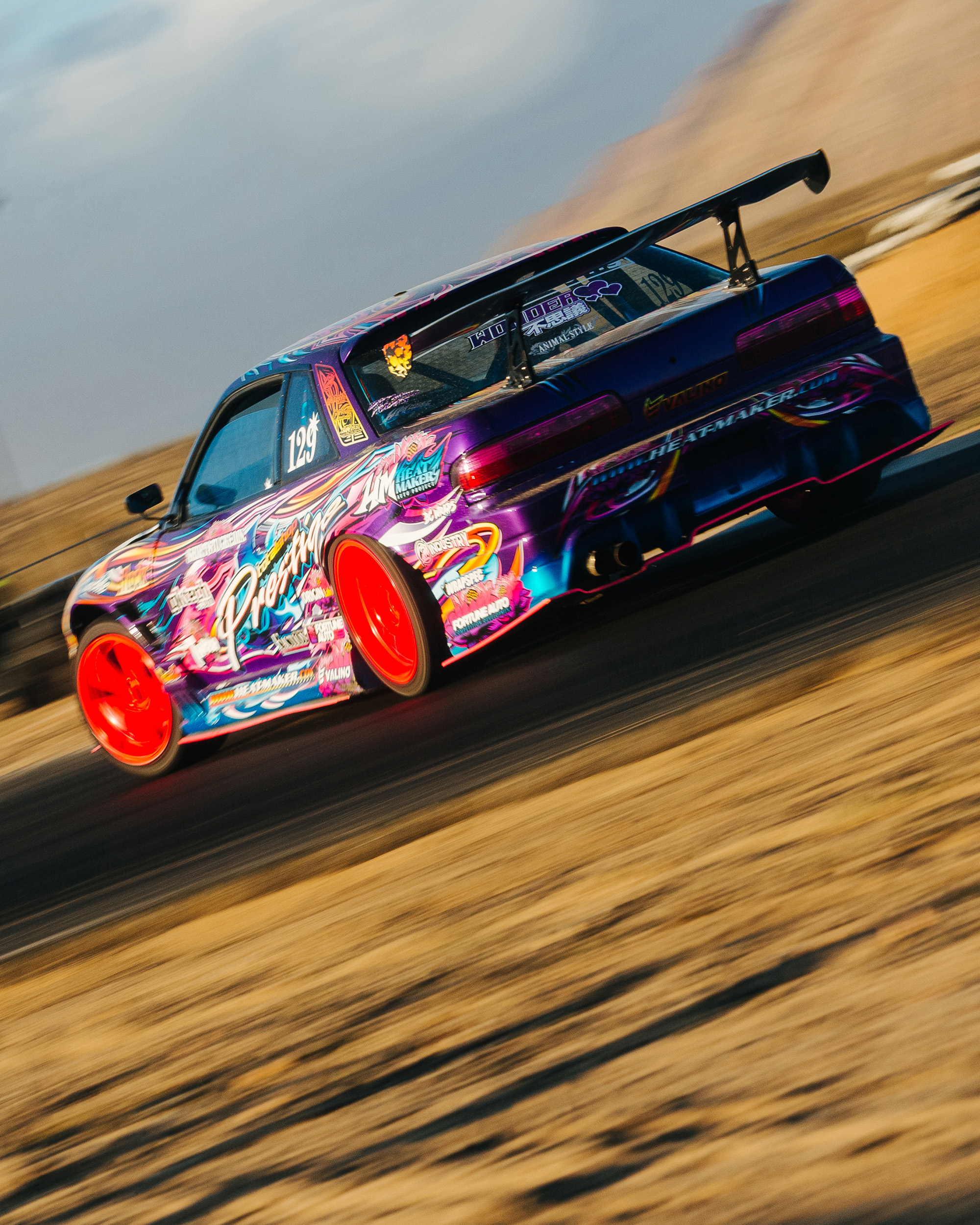
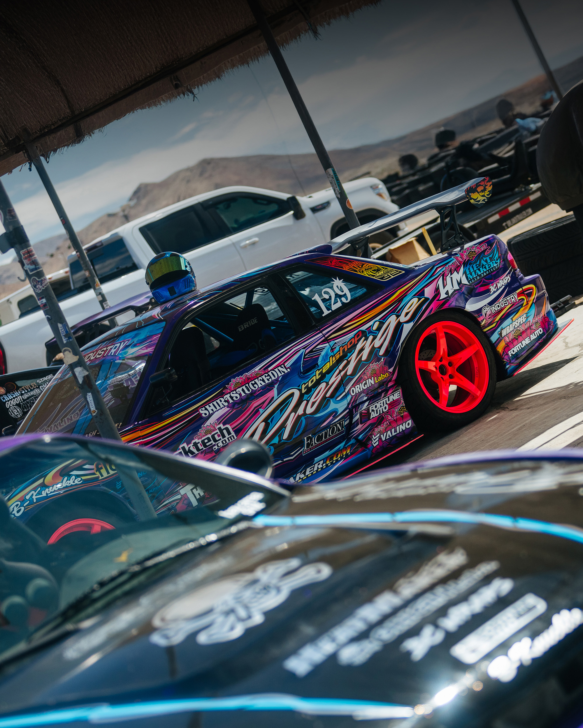
At first glance it is hard to identify exactly what you are looking at, and that is entirely the point.
The abstract forms merge into one continuous flowing composition that moves with the car rather than sitting on top of it, anchored by the purple base that ties everything together.
Iterations
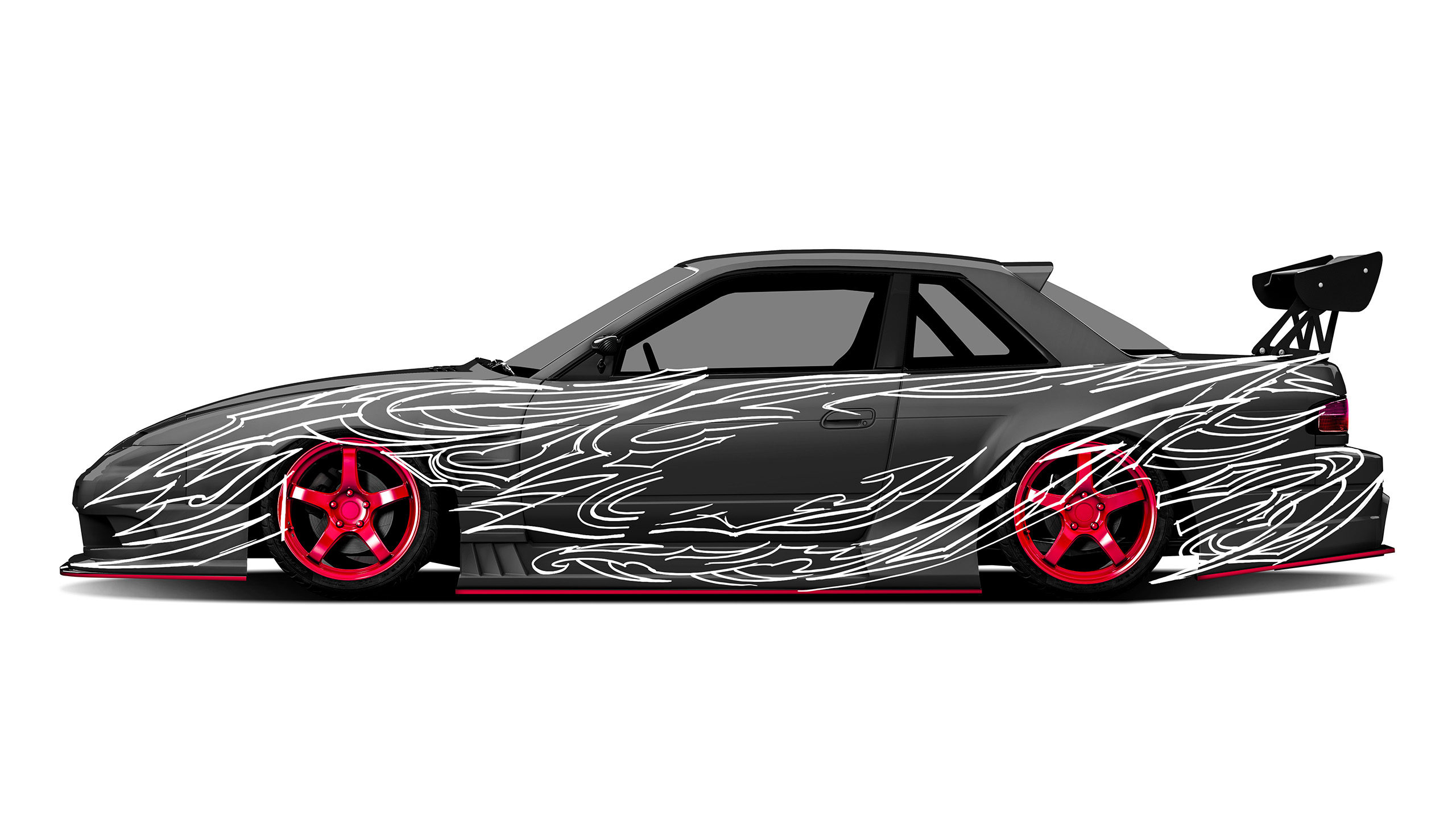
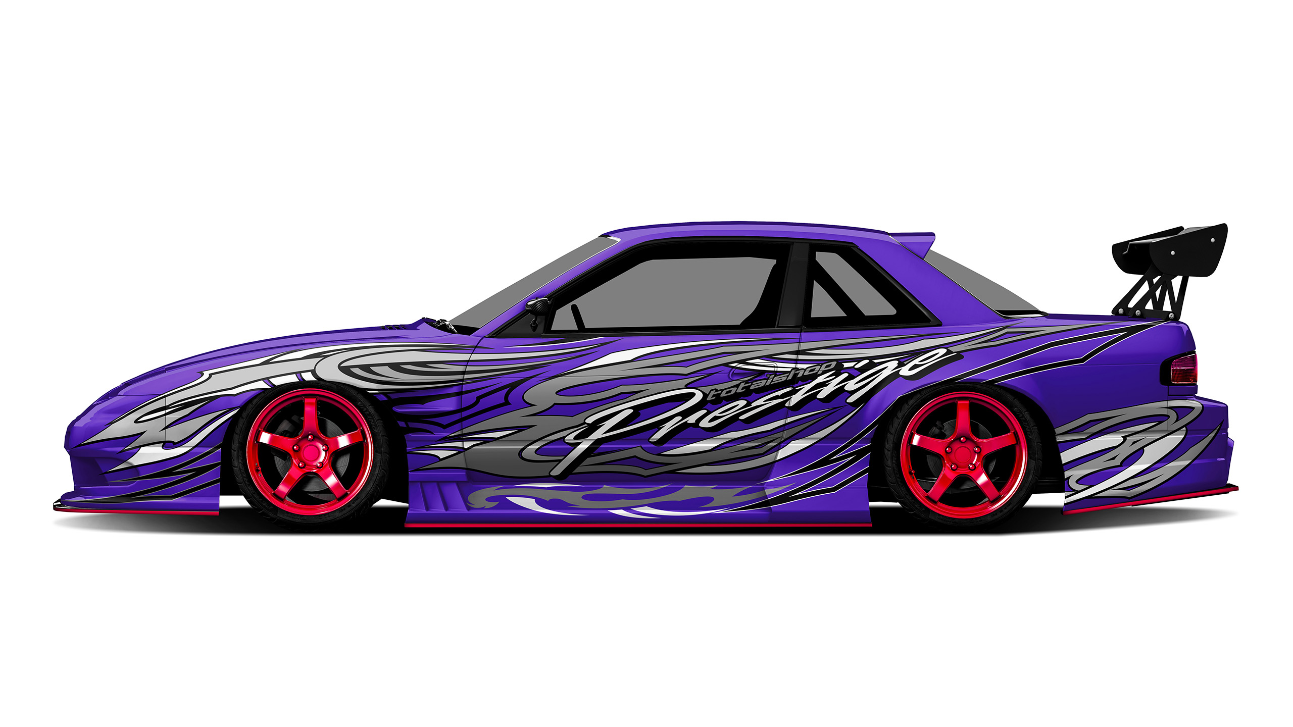
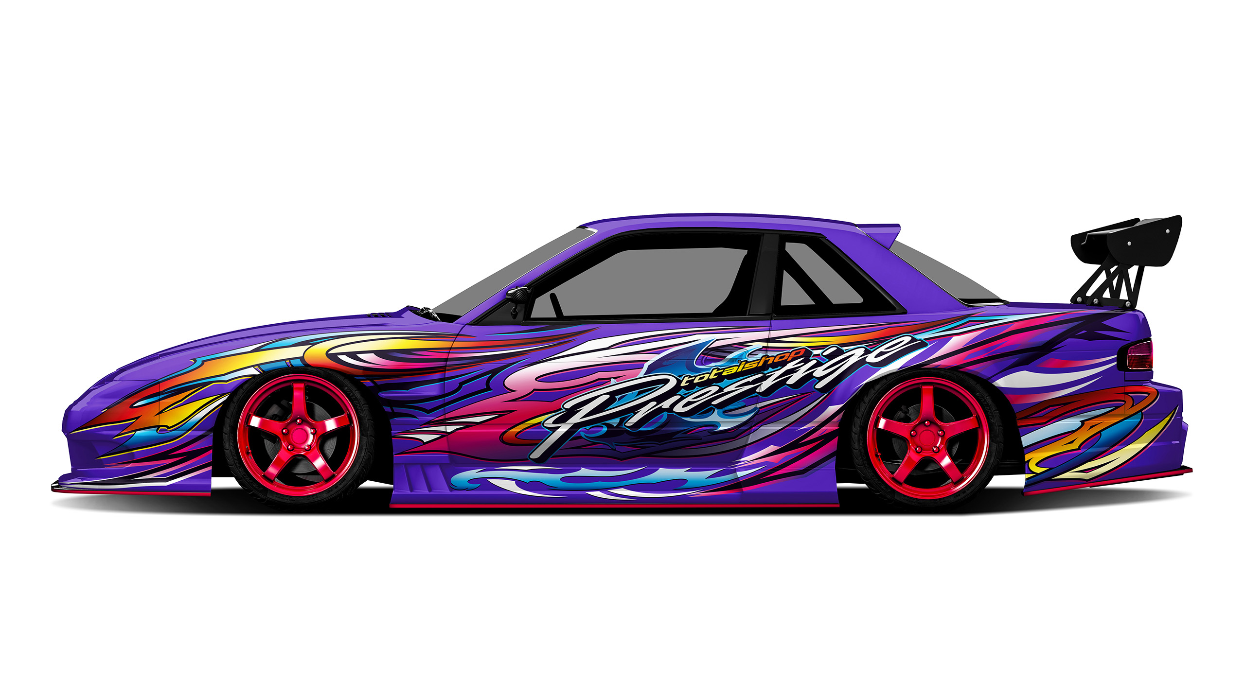
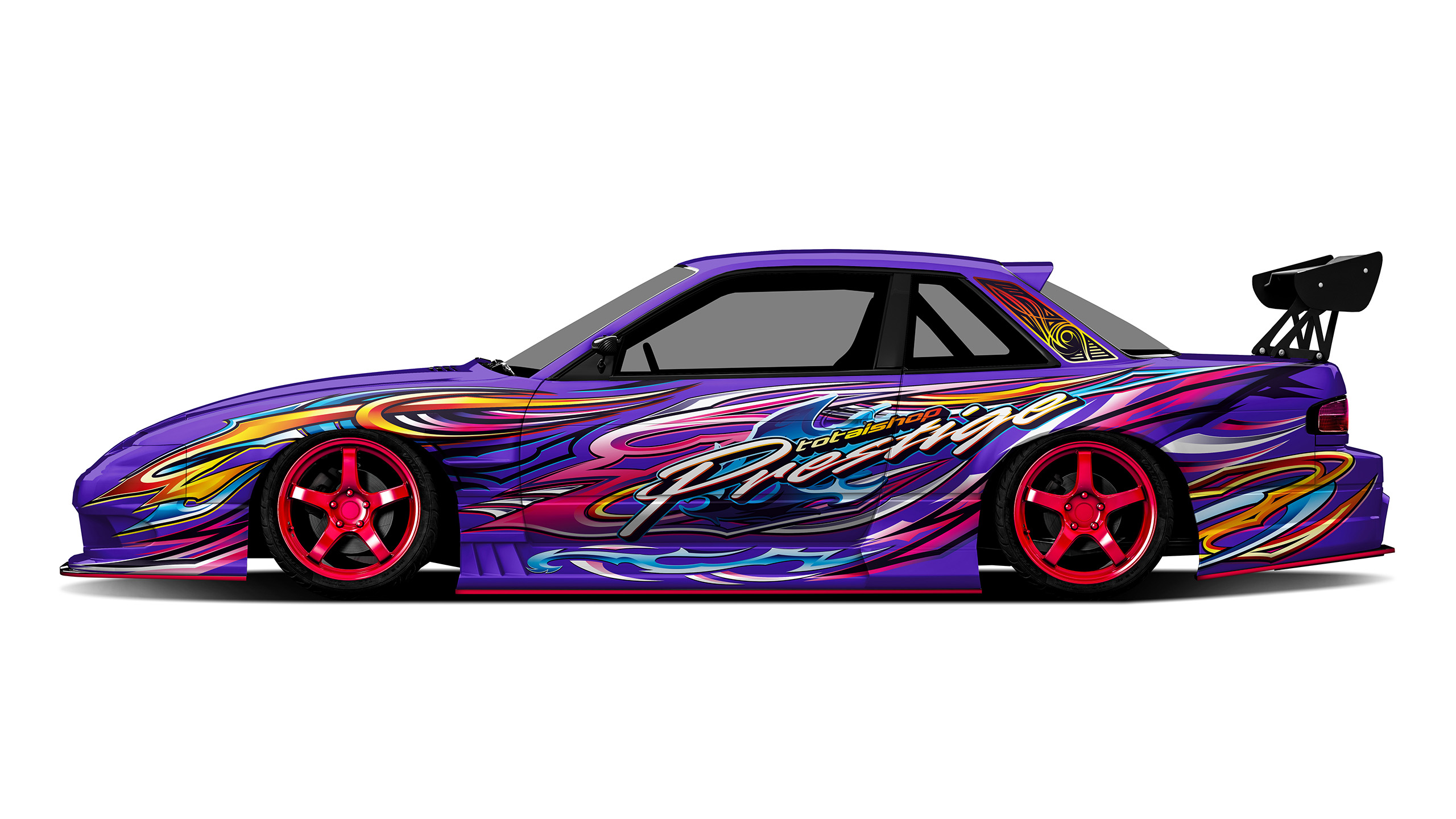
01 / 04
The brief
Few people know that “CM” stands for Creative Motion, and that detail alone says something about how this design was approached. The S13 is the natural home for this kind of work: the design is a direct vision of what S-chassis cars looked like in the golden era of D1 Grand Prix Japan, rebuilt with a contemporary approach and our own interpretation of what that energy actually means today.
Colour system
Pillars and depth
Midnight
#090015
Primary body
Royal violet
#312672
Graphics lead
Magenta
#E31985
Graphics support
Azure
#2C77BB
Flame accent
Orange
#F59C24
Lettering
White
#FFFFFF
“People at the track cannot tell where one shape ends and the next begins. They just know it looks right.
”
Final build
Project owner
@itsyaustin